This way to the arch
Snapshots / Oct. 16, 2016


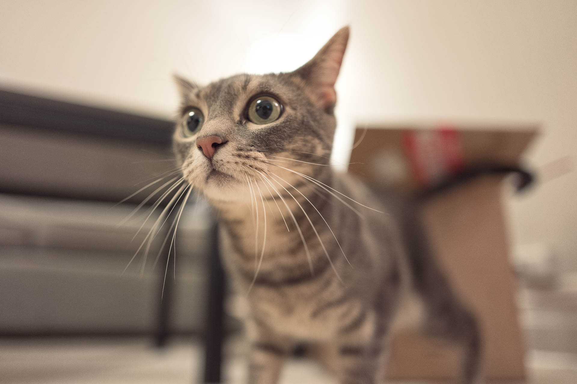
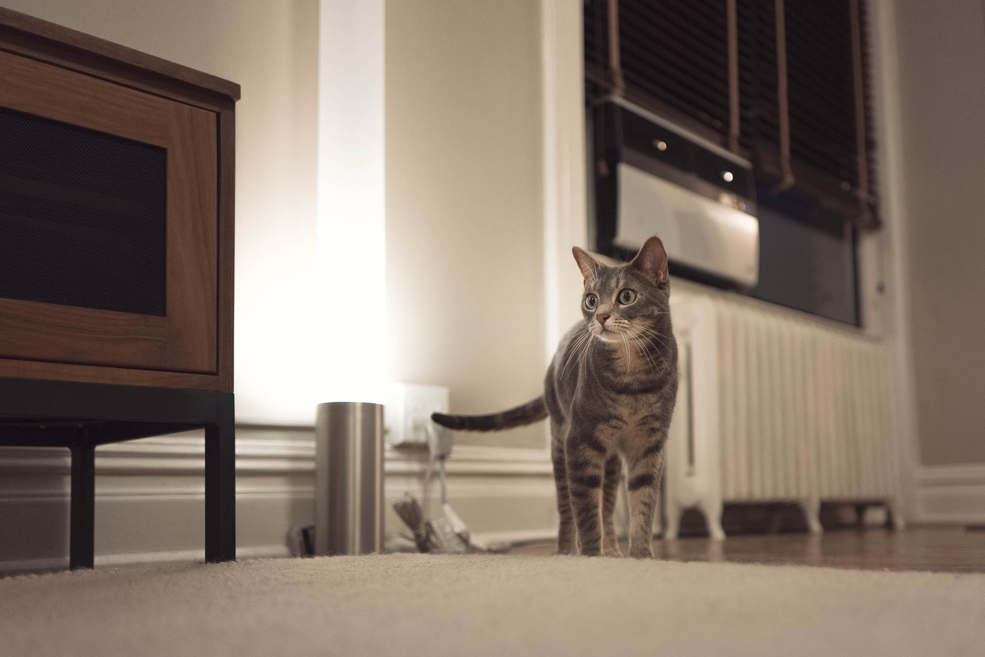
I’m super excited about my new Leica Q! I just unboxed it this evening, and even though I’ve only taken a few shots inside I can already tell we’re going to be good friends. Enjoy some Saffy at f1.7 … because why should anything be in focus!


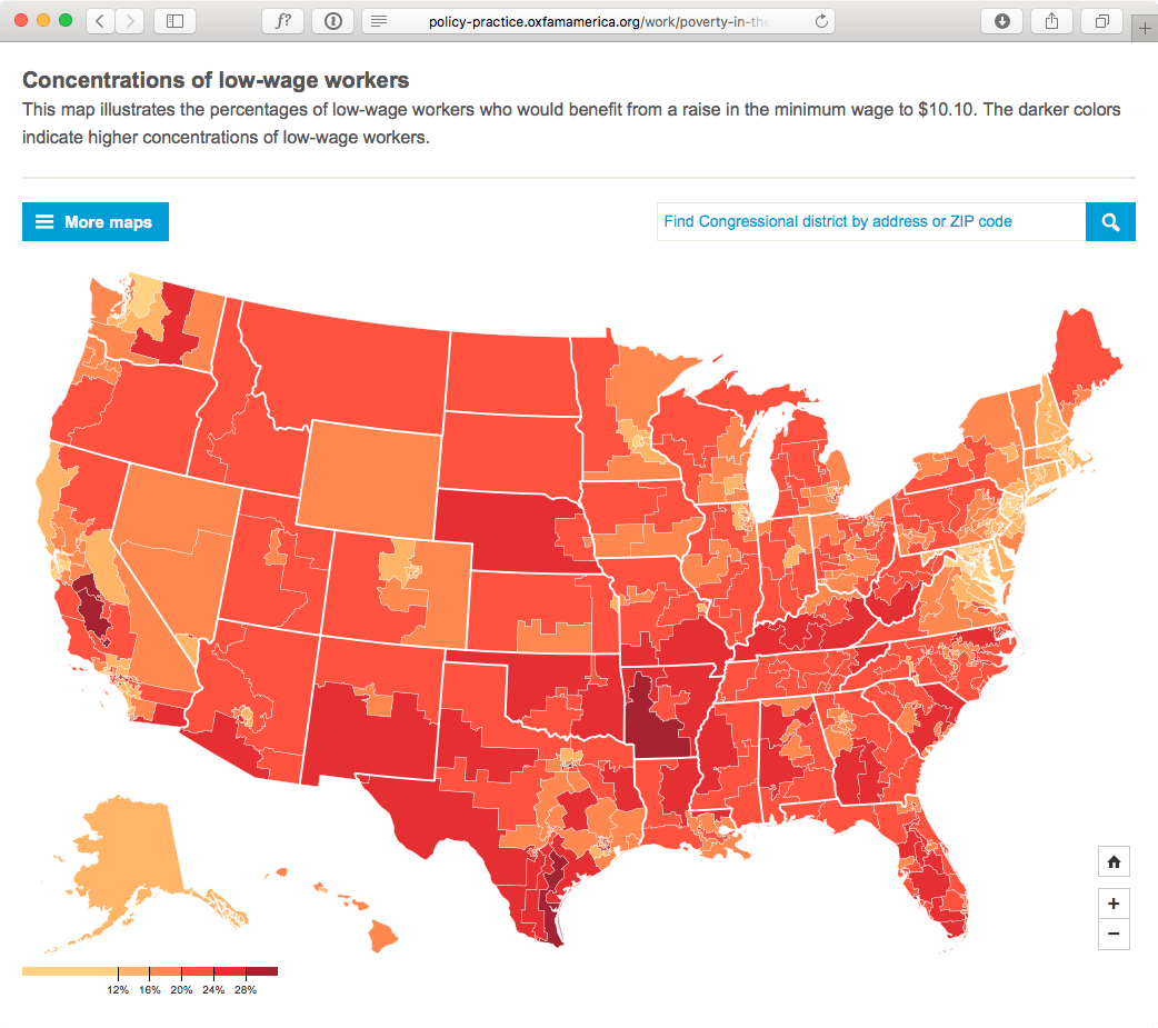
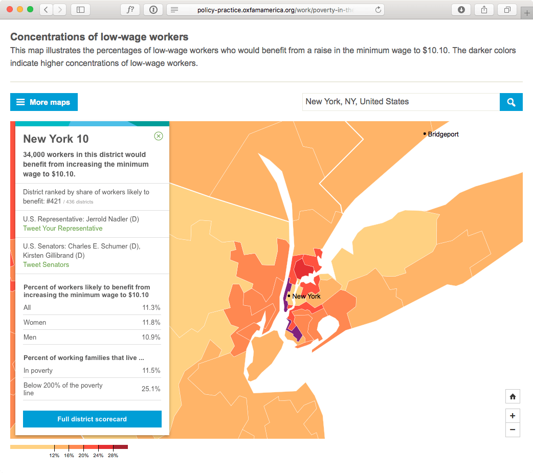
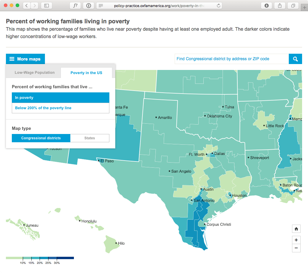
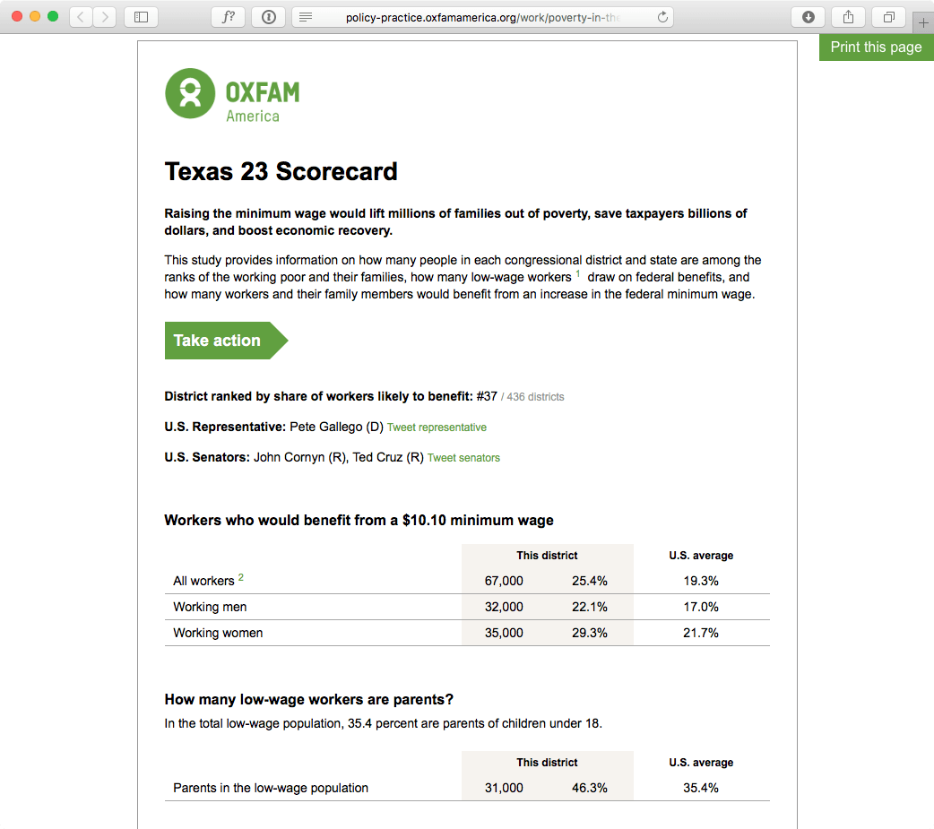
Oxfam America commissioned a huge study of the impact a $10.10 federal minimum wage would have on the country both at the state and congressional district levels. They asked me to create maps for a small slice of that data. But even that small slice was a big project —there are 20 maps users can explore and 486 print-ready scorecards. Also there’s twitter handles for everyone is congress so users can tweet details about their district and @mention their representatives and senators.
This wasn’t my first congressional map rodeo, but this version added more detail for urban areas like New York, markers for larger/notable cities across the country, and a search to look up a congressional district by street address or ZIP code.
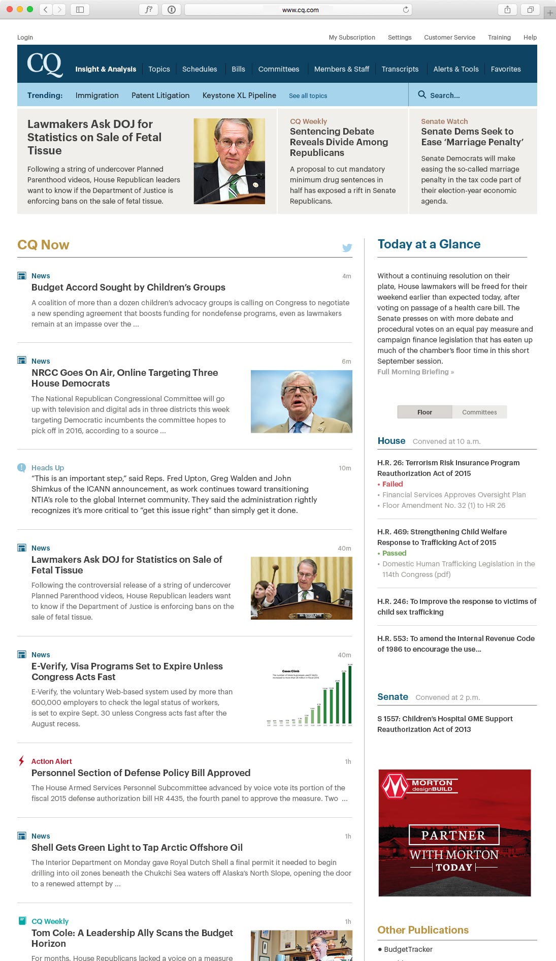
A previous design change to CQ.com proved unpopular with customers. This design provided better page hierarchy and structure and shifted the page’s focus from time-consuming curated news wells to CQ Now, a partially automated feed of breaking news, updates and other key content. Click for a more complete view.
CQ’s brand identity hadn’t been revised or even properly maintained since the early 1990s. As a result, over the years the ‘CQ look’ was abandoned as it became dated and no singular person or department that had the authority to champion any brand consistency. The Roll Call merger didn’t help matters as internal groups argued over abandoning the old brand and replacing it with the new CQ Roll Call gold and black. But with the creation of a unified product department and a desire to update CQ.com and it’s various product lines, we really needed to decide on a new consistent look.
The ‘new’ look was more of a refresh. Instead of a drastic change, I elected to keep the logo very much in the same spirit as the old one. Instead of the vertically squished New Baskerville, the new logo uses a modified Lyon Display.
![]()
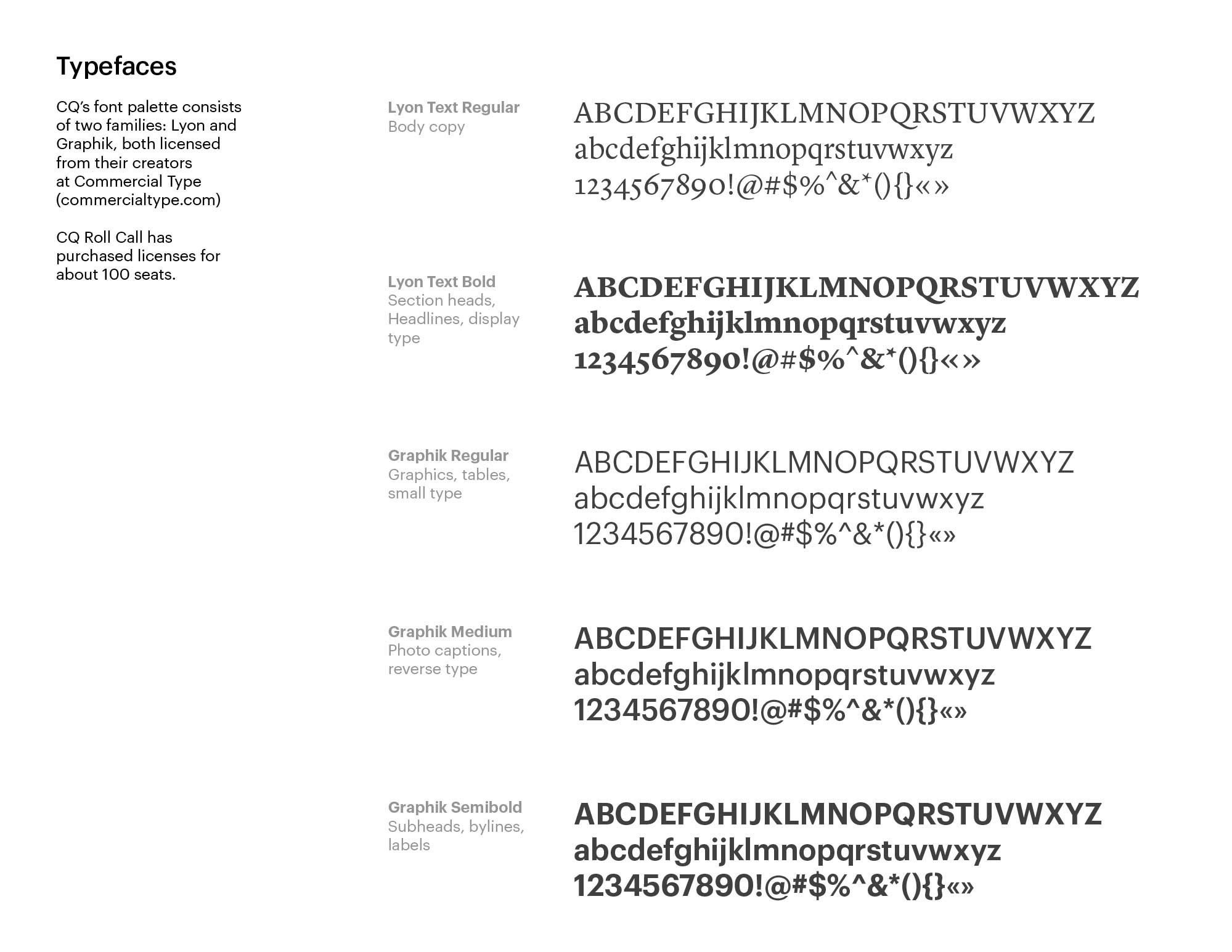
The typefaces are Commercial Type’s Lyon and Graphik. These are the same typefaces used by Roll Call, but for CQ, Graphik takes center stage, where Roll Call is predominately Lyon.
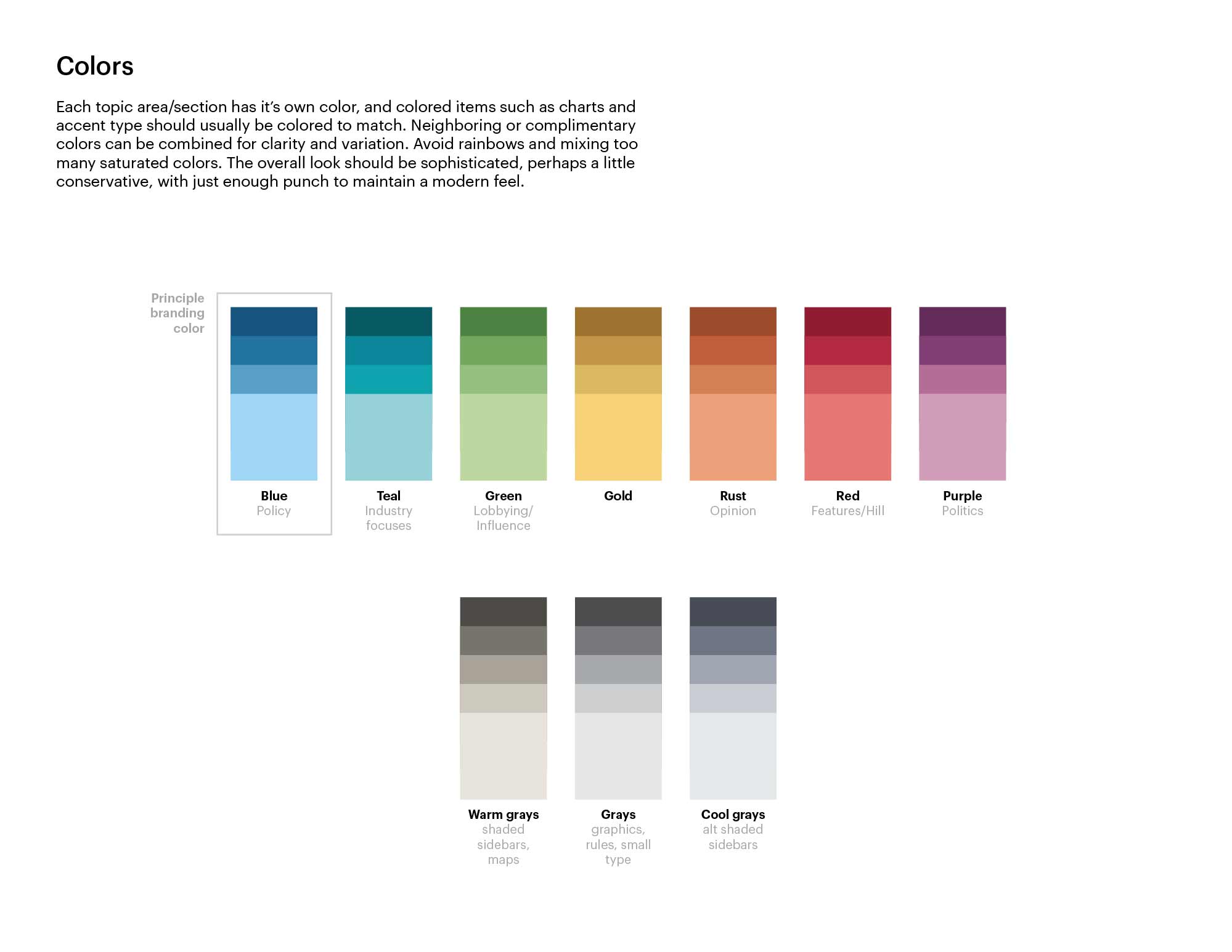
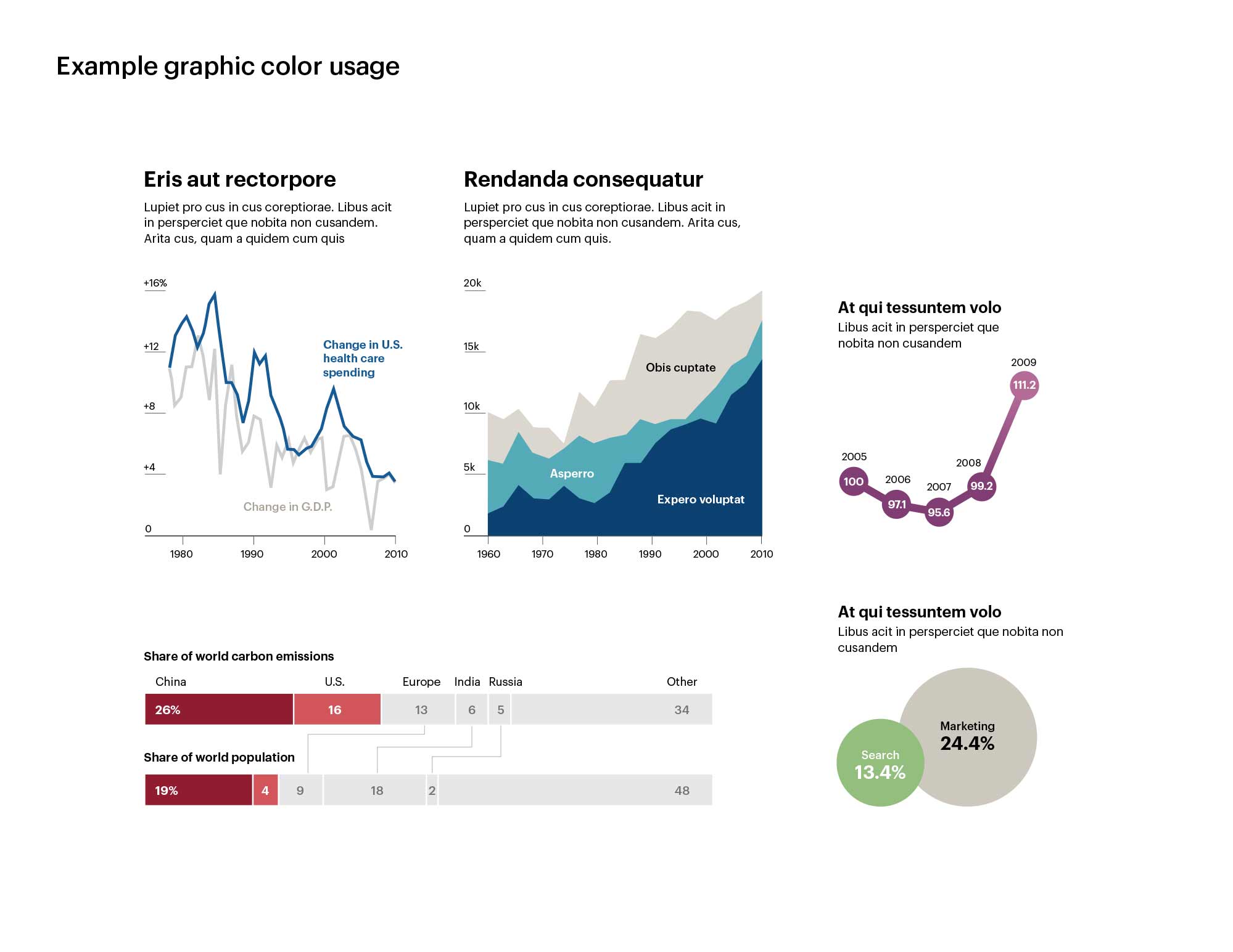
The primary branding color stayed blue but additional colors were added for different verticals and general utility. And since it’s me, there’s even some basic infographic styling.
I brought this adorable, 3-month old bundle of energy home today from the Washington Animal Rescue League. Their facility is a pain to get to, but it’s super nice. If you’re in the market for a new dog or cat I highly recommend them!
