Rising defaults
Design / Apr. 15, 2011


I brought a little BusinessWeek into this graphic showing the destinations and number of flights that are currently exempt from National airport’s 1,250-mile limit.
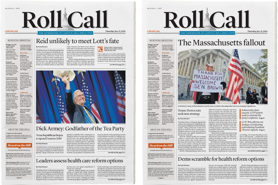
To say that I was flattered when the folks at CQ-Roll Call asked me to help redesign the daily print Roll Call product would be a gross understatement. And even though I was already working on the WBJ redesign, that’s just not the sort of request you can say no to.
Roll Call had been without a redesign for even longer than the Business Journal, and was thus a mix of dated typography, quirky stock art icons and styles left behind from myriad designers that had worked there over the years. Roll Call is also pretty conservative (visually speaking) and they focus much more on long-form writing than design. So the design goal was pretty simple: A clean, simple and unified look that would bring some visual sophistication to their sophisticated stories. For my part, I pushed them to do more shorter-form stories, run larger photos and make more use of color.


Because of the way they are staffed, Roll Call doesn’t use many graphics. The poll map was very easy to update and provided a visual anchor for the At the Races standing feature.

Roll Call was resistant to color on the nameplate and section flags. The nameplate ended up black, but the inside sections are now color.
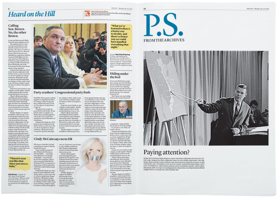
Typefaces used are Lyon Display, Lyon Text and Graphik — all available from my pal Christian Schwartz over at Commercial Type.

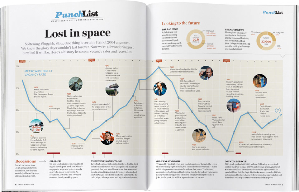
This spread was an tribute to our now dead big brother, Conde Nast Portfolio — it’s a spitting image of a graphic they did on Nasa’s budget. While Portfolio did outer space, we did local commercial real estate space .
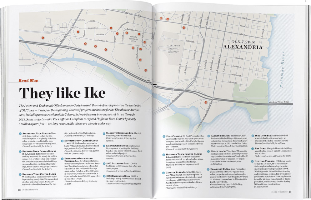

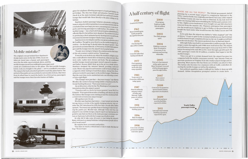
The opening spread of this On Site story about the modernization of Dulles International Airport is a two-page infographic showing the plan for additional terminals and runways connected by the new train system. Created using Google Sketchup and Adobe Illustrator. Final touch-ups and blur added in Photoshop.

It’s a little funny how all the jetways look like caterpillar legs.


This story was largely a timeline aligned to the REIT’s stock performance.