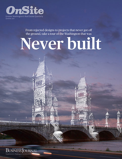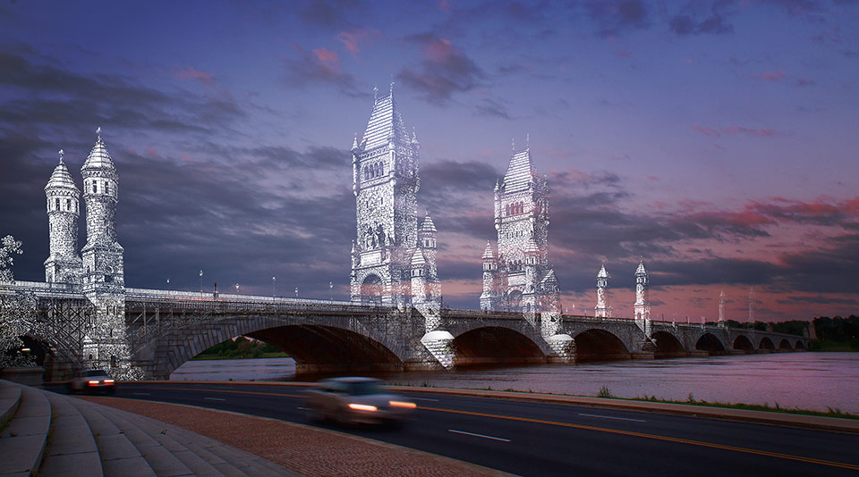

To illustrate the cover story about architecture/CRE projects that were planned but never executed, I mashed up a post-cival war plan for a gothic tower Memorial Bridge with a photo I took of the actual Memorial Bridge that was built in the 1920s. I was really hoping to shoot the bridge from the opposite side so you could see the Lincoln in the distance, but it was just impossible since the Virginia side is pretty heavily wooded.

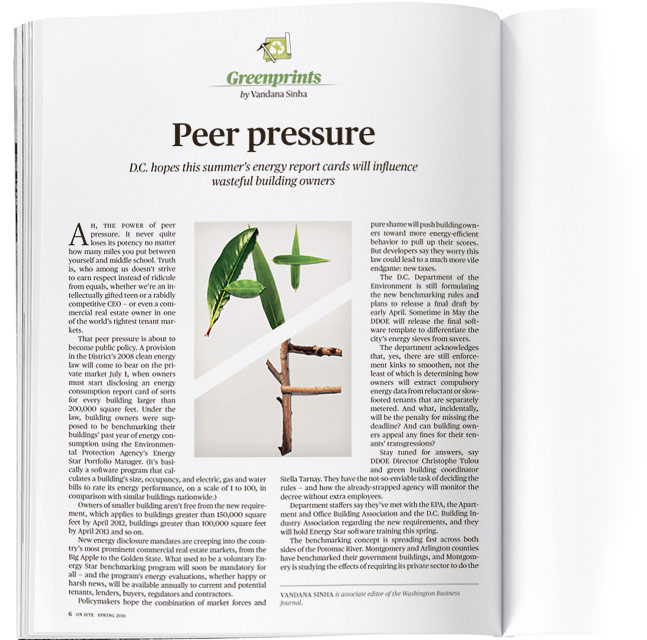
A quick illustration for a Green Prints column in On Site about grading commercial buildings’ greenness.
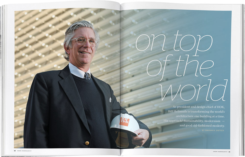
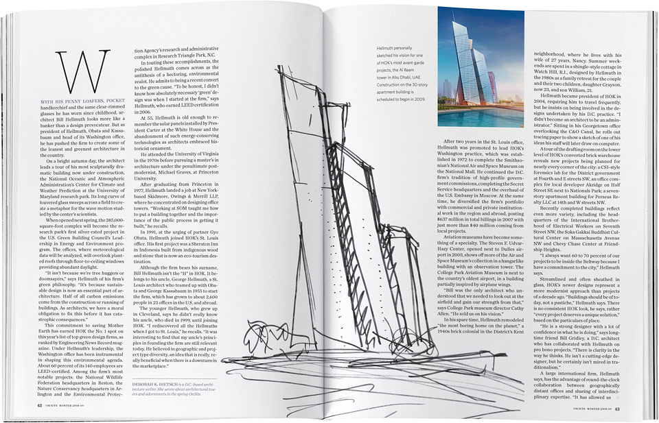
Another spread from this issue after the jump »

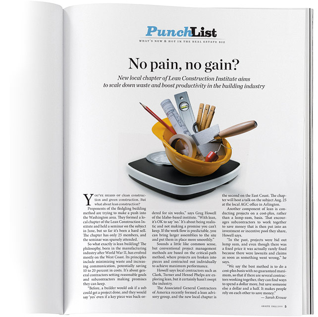
Another quick photo illustration about the building industry trimming some fat.

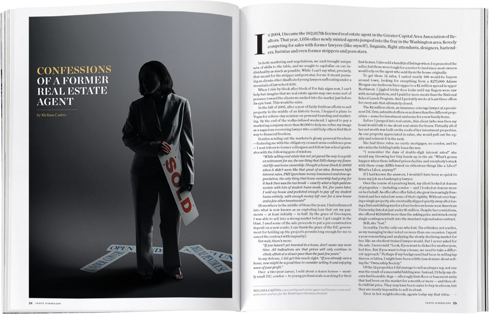
Given On Site’s content type and shoe-string budget, we don’t do many pro (or “pro”) photo shoots, but this studio shot was easy and effective.The Business Journal photographer’s hand-me-down camera that we had to use was so resolution challenged that I had to shoot Melissa as tight as possible and fill in the background in Photoshop. Even then we only managed 275 dpi.
And while we’re doing confessions, our “studio” is actually a storage closet which is still used as a storage closet. We occasionally have CEOs and other big-wigs in the office for interviews and still or video shoots. Watching their expression as they realize they’re being led into a closet instead of the photo studio they were imagining is priceless.


Cover of the Fall 2008 On Site.

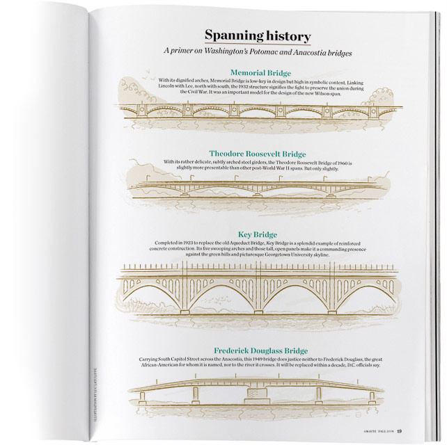
This started out as a small box to accompany an architectural criticism of the new Wilson Bridge., but another story fell through and we had some space to burn, so we initially decided to go shoot photos of the other D.C. bridges. Then I thought it would be much nicer and more “architectural” to have Luc Latulippe draw them elevation style. I’m quite happy with the way it turned out.
