CQ logo and branding
Design / Nov. 10, 2014
CQ’s brand identity hadn’t been revised or even properly maintained since the early 1990s. As a result, over the years the ‘CQ look’ was abandoned as it became dated and no singular person or department that had the authority to champion any brand consistency. The Roll Call merger didn’t help matters as internal groups argued over abandoning the old brand and replacing it with the new CQ Roll Call gold and black. But with the creation of a unified product department and a desire to update CQ.com and it’s various product lines, we really needed to decide on a new consistent look.
The ‘new’ look was more of a refresh. Instead of a drastic change, I elected to keep the logo very much in the same spirit as the old one. Instead of the vertically squished New Baskerville, the new logo uses a modified Lyon Display.

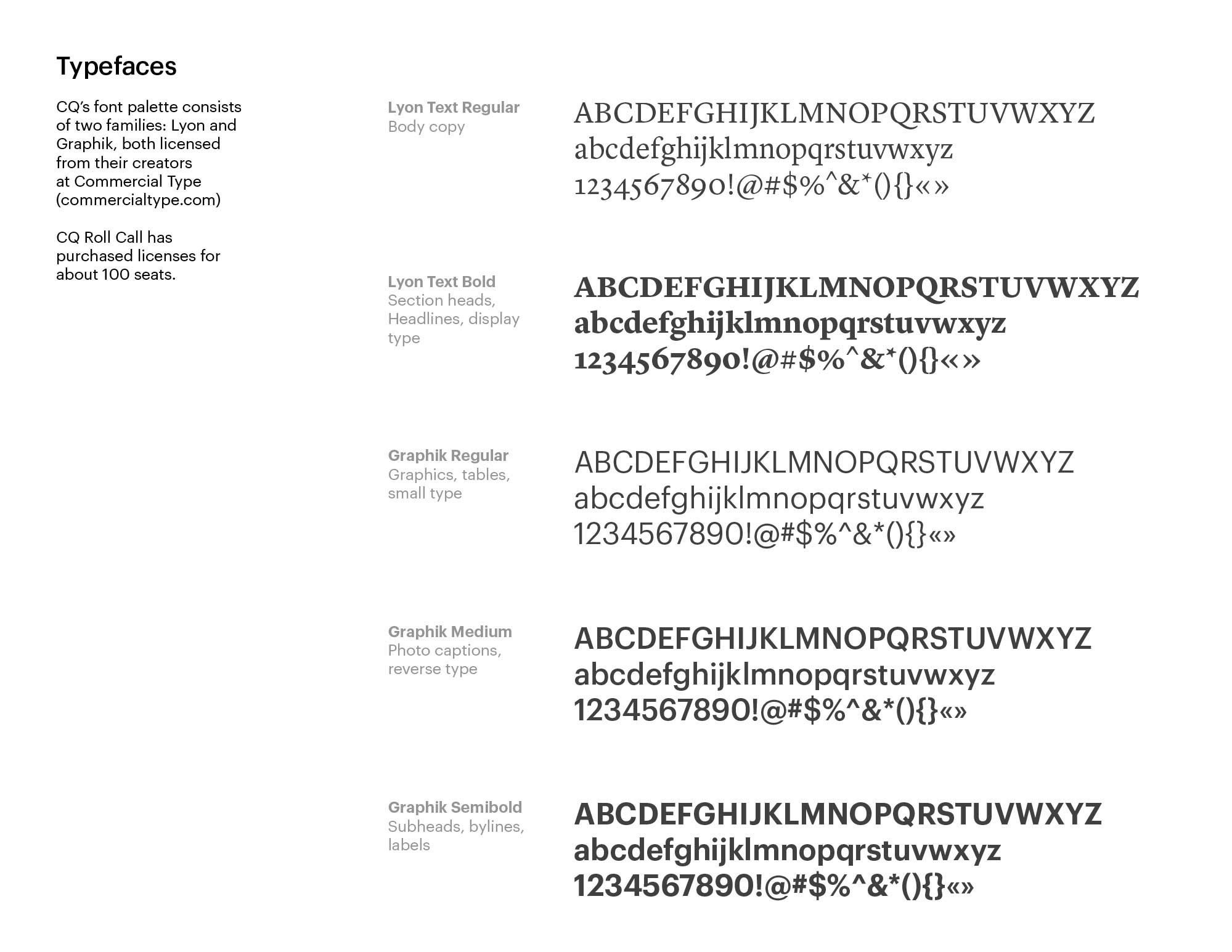
The typefaces are Commercial Type’s Lyon and Graphik. These are the same typefaces used by Roll Call, but for CQ, Graphik takes center stage, where Roll Call is predominately Lyon.
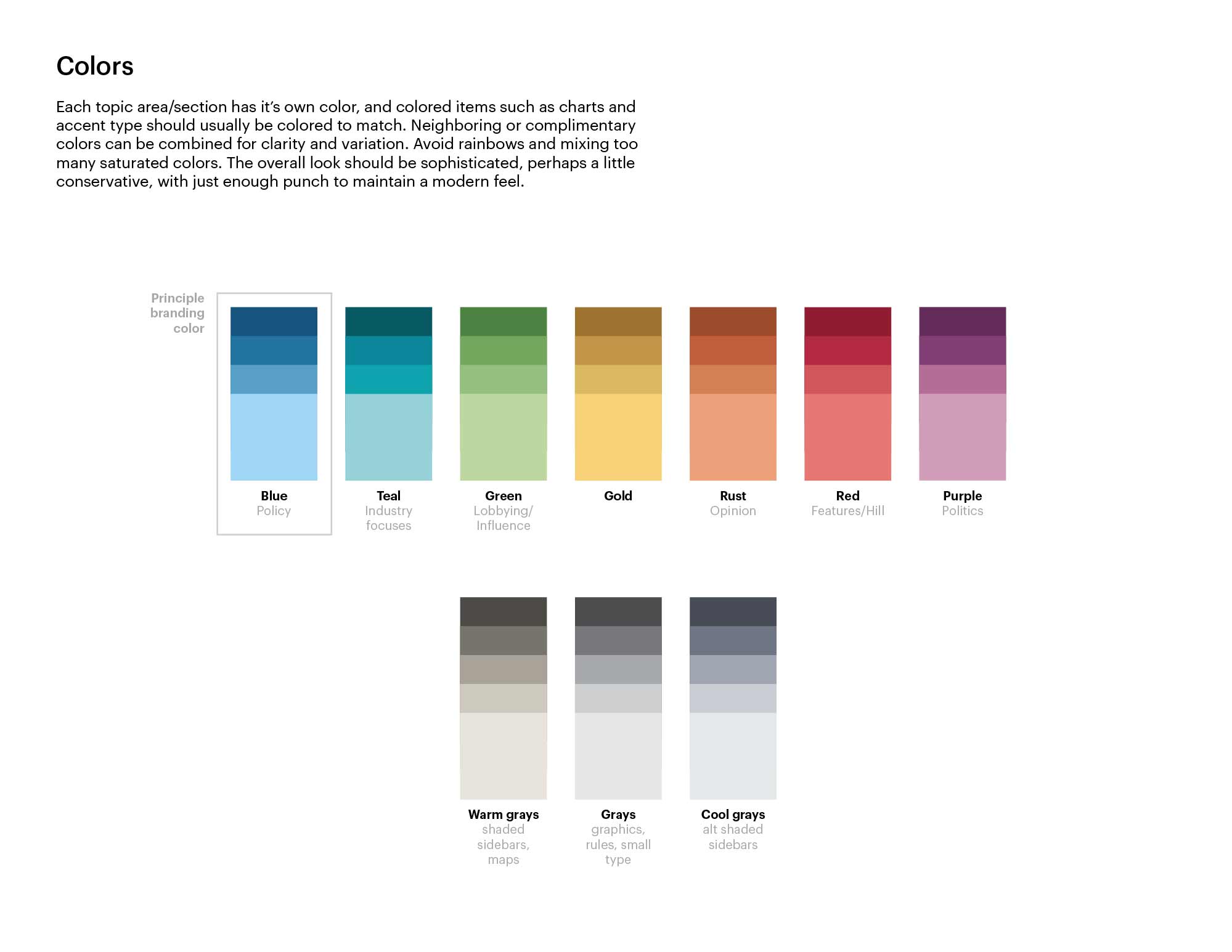
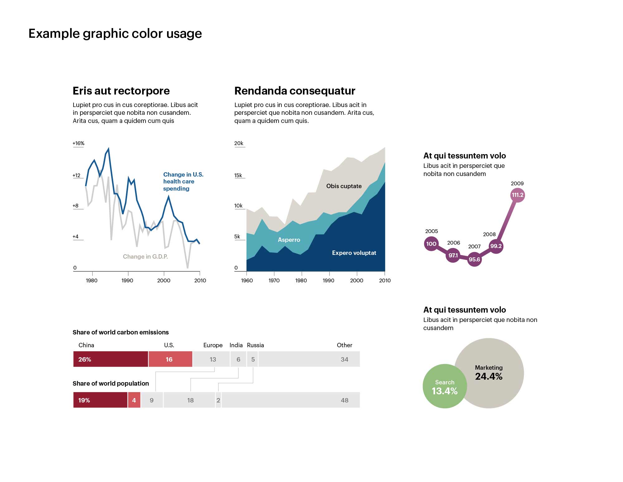
The primary branding color stayed blue but additional colors were added for different verticals and general utility. And since it’s me, there’s even some basic infographic styling.


