Mall of shame
Design / May. 16, 2008
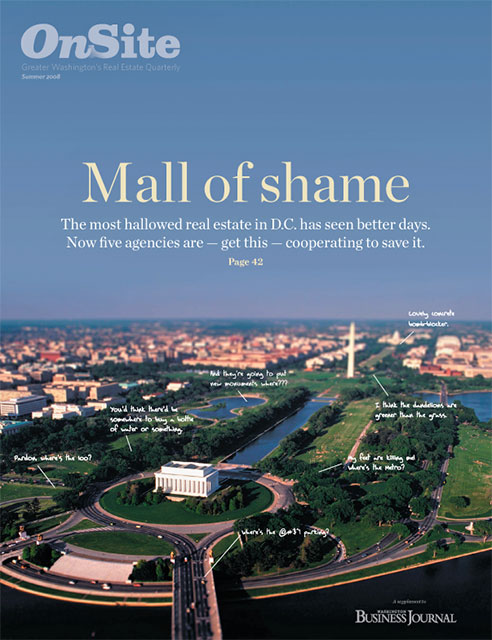
Cover of the Summer 2008 issue of On Site. A faux tilt-shift image of the National Mall with cheeky (but common) complaints about the conditional and infrastructure (or lack there off.)

Cover of the Summer 2008 issue of On Site. A faux tilt-shift image of the National Mall with cheeky (but common) complaints about the conditional and infrastructure (or lack there off.)
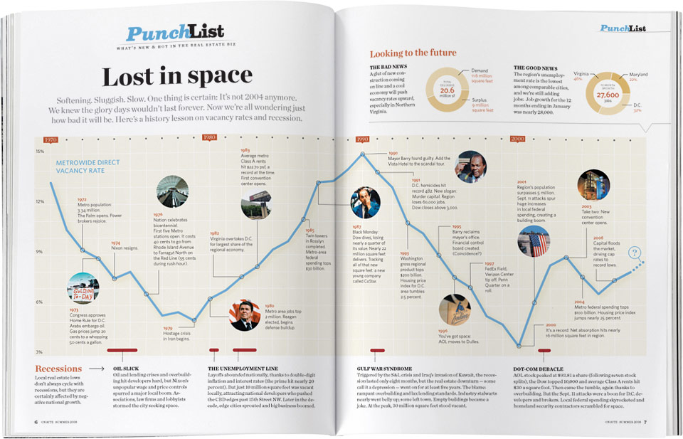
This spread was an tribute to our now dead big brother, Conde Nast Portfolio — it’s a spitting image of a graphic they did on Nasa’s budget. While Portfolio did outer space, we did local commercial real estate space .
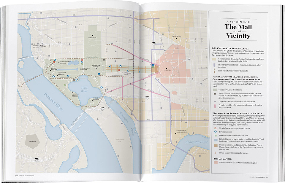
I couldn’t find a map with the scale and detail level I wanted for this graphic, so I ended up drawing the whole thing myself. What are Saturdays for, no?

I’m totally to blame for the dime thing, but I’m not at all sorry. I’m still amused by the idea of Dwight Schar’s annual compensation in dimes spanning the entire globe.
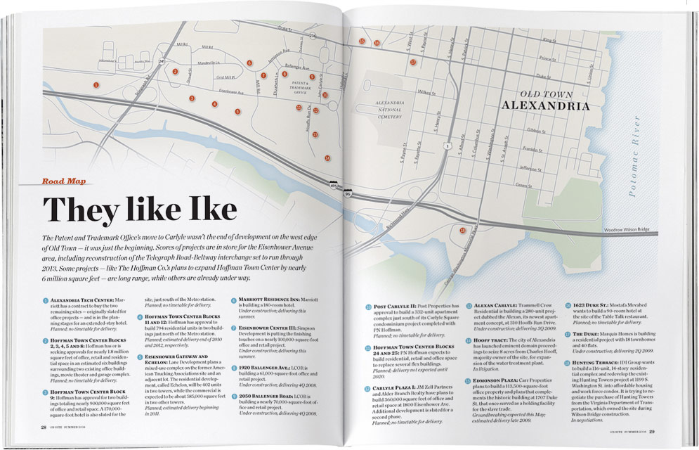

I have four words for you: Map in a fireball!

The opening spread of this On Site story about the modernization of Dulles International Airport is a two-page infographic showing the plan for additional terminals and runways connected by the new train system. Created using Google Sketchup and Adobe Illustrator. Final touch-ups and blur added in Photoshop.

It’s a little funny how all the jetways look like caterpillar legs.
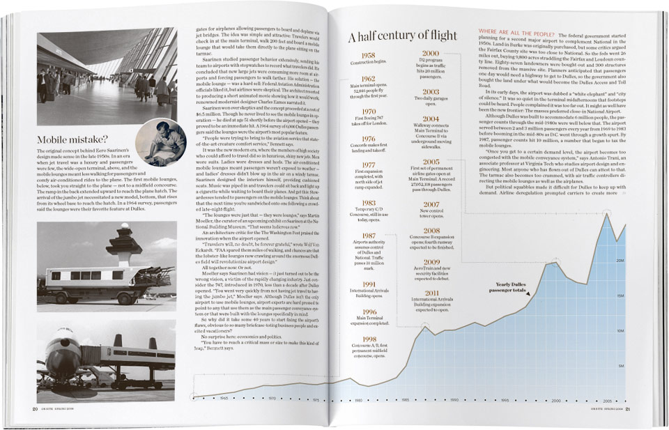

For a story that had too many “boxes” and no dominant art, I thought this spread came together nicely. the information is dense, but it keeps a very tidy and airy feel.