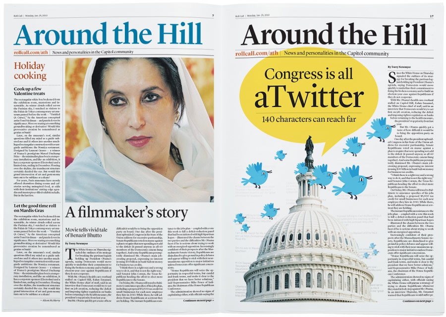
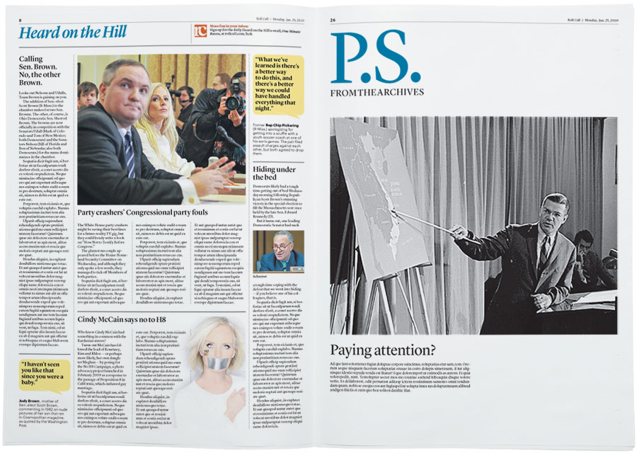
Washington Business Journal redesign

Design / Apr. 9, 2010


Almost a year and a half in the making, this was the largest redesign WBJ has done in a long while, but it was almost even bigger. Plans to go to a five-column format, a smaller web width and heavier, whiter paper died about a year into the process. And despite careful planning, Page 1 and the nameplate were changed less than a week before launch thanks to The Washington Post’s earlier-than-expected launch of Capital Business. While I’m largely pleased with the results, Page 1 still feels a little like a frankenstein project.


Inside pages were opened up slightly, making way for Guardian and Publico-style layouts with large art.


Section fronts became section spreads to allow a single block of editorial going across the spread and dedicated non-full page ad space.
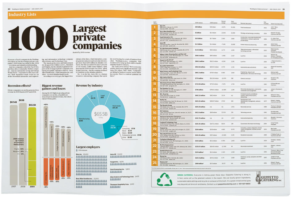

The use of color changed significantly too. The paper is now 100 percent color and the color palette is strong and bright.


The Opinion pages are the only pages that deviate from the four column grid — it’s actually five with a two-on-three staff column in the center.

Typefaces used are Publico Headline, Publico Text, Guardian Sans and Guardian Text Sans — all available from my pal Christian Schwartz over at Commercial Type.
Roll Call redesign

Design / Apr. 1, 2010


To say that I was flattered when the folks at CQ-Roll Call asked me to help redesign the daily print Roll Call product would be a gross understatement. And even though I was already working on the WBJ redesign, that’s just not the sort of request you can say no to.

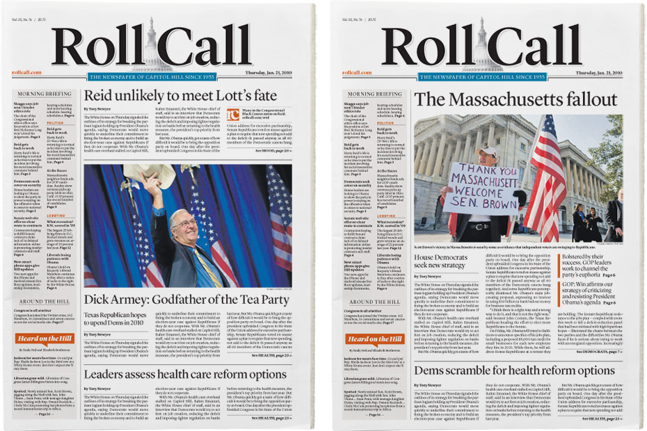
Roll Call had been without a redesign for even longer than the Business Journal, and was thus a mix of dated typography, quirky stock art icons and styles left behind from myriad designers that had worked there over the years. Roll Call is also pretty conservative (visually speaking) and they focus much more on long-form writing than design. So the design goal was pretty simple: A clean, simple and unified look that would bring some visual sophistication to their sophisticated stories. For my part, I pushed them to do more shorter-form stories, run larger photos and make more use of color.


Because of the way they are staffed, Roll Call doesn’t use many graphics. The poll map was very easy to update and provided a visual anchor for the At the Races standing feature.


Roll Call was resistant to color on the nameplate and section flags. The nameplate ended up black, but the inside sections are now color.

Typefaces used are Lyon Display, Lyon Text and Graphik — all available from my pal Christian Schwartz over at Commercial Type.