2011 Book of Lists cover
Design / Dec. 17, 2010

Photo of the Metro tunnel out to Tysons by the venerable Joanne S. Lawton.

Photo of the Metro tunnel out to Tysons by the venerable Joanne S. Lawton.

The famous duomo dome

The campanile (bell tower)

Looking down from the top of the dome

Best find at the Duomo museum: The middle finger of the right hand of John the Baptist

Mosaic ceiling in the baptistry

Sunday was apparently some sort of holiday, but we never found out what the occasion was. We were almost ready to leave the hotel for the day when this little band marched into the Piazza della Rotonda. They stayed for 15 minutes or so playing what must have been the Italian equivalent of John Phillips Sousa.

We had already seen the Colosseum and Forum, but not the Palantine. Most of the hill is not all that impressive, but I knew I would regret it if I didn’t go.

Even though our Roma passes were still valid, apparently you can’t get the discount twice for the same sight — meaning we had to pay the full price to get back into the Palantine — which really put me in a foul mood for the first half of the day. So to feel like we got our money’s worth we went back to the Forum.
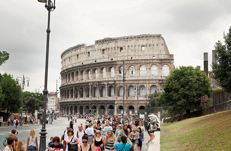
And the Colosseum
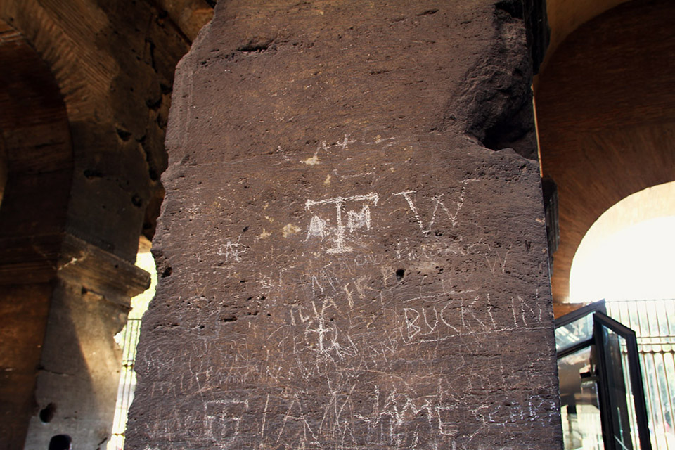
Roman’s were big graffitiers, so maybe this bit on one of the Colosseum’s support walls is appropriate. Or not.

We finished by sitting and people watching on the Campidolglio.

Fountain near the Termini Station

The pizza at La Gallina Bianca (The White Chicken) was amazing.

Outside the Borghese Gallery

A statue/monument inside the Villa Borghese, which despite its name, is not a house, but a park. The umbrella pines are amazing; I wish we had them in the States.

George Washington Street!

Top of an arch in the Borghese park.

Jeff pointing the way out of the Villa Borghese park. Sadly my camera battery died short after taking this photo.

Statue bits laying about a courtyard in the Capitoline Museums.

One of the walls in that same courtyard.

St. Peter’s Square

An illegal photo of the Sistine Chapel ceiling. It’s just mean that they won’t let you take photos.

Late afternoon light through the drum of St. Peter’s Basilica’s main dome.

Hoodlums and drunken teenagers at the Spanish Steps.

Mmmm … gelato.

Piazza della Rontonda and the Pantheon.

Piazza Navona and Bernini’s famous Fontana dei Quattro Fiumi (Fountain of Four Rivers.)

The Moro fountain on the south end of Piazza Navona.
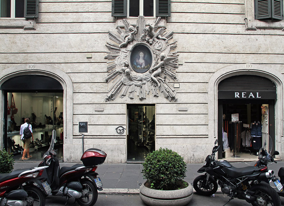
Many buildings in Rome have these architectural spots for saints, but this one was particularly beautiful.

The Vittorio Emanuele II monument (aka “the wedding cake”) and crazy Italian drivers.

The Arch of Contantine seen from the Colosseum.

Almost a year and a half in the making, this was the largest redesign WBJ has done in a long while, but it was almost even bigger. Plans to go to a five-column format, a smaller web width and heavier, whiter paper died about a year into the process. And despite careful planning, Page 1 and the nameplate were changed less than a week before launch thanks to The Washington Post’s earlier-than-expected launch of Capital Business. While I’m largely pleased with the results, Page 1 still feels a little like a frankenstein project.


Inside pages were opened up slightly, making way for Guardian and Publico-style layouts with large art.

Section fronts became section spreads to allow a single block of editorial going across the spread and dedicated non-full page ad space.
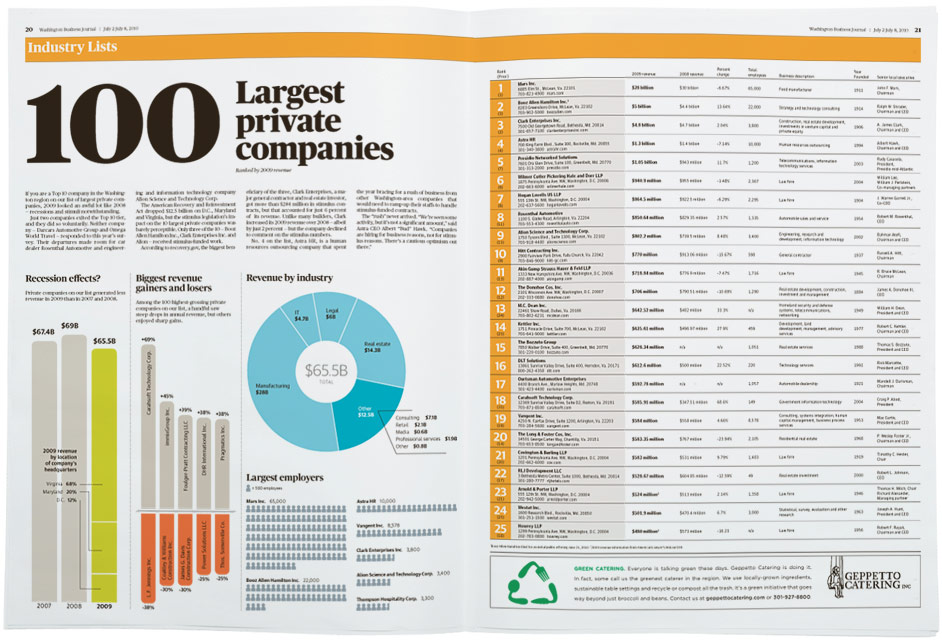
The use of color changed significantly too. The paper is now 100 percent color and the color palette is strong and bright.

The Opinion pages are the only pages that deviate from the four column grid — it’s actually five with a two-on-three staff column in the center.
Typefaces used are Publico Headline, Publico Text, Guardian Sans and Guardian Text Sans — all available from my pal Christian Schwartz over at Commercial Type.
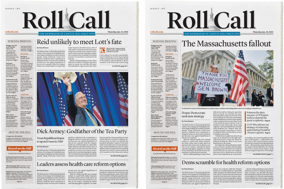
To say that I was flattered when the folks at CQ-Roll Call asked me to help redesign the daily print Roll Call product would be a gross understatement. And even though I was already working on the WBJ redesign, that’s just not the sort of request you can say no to.
Roll Call had been without a redesign for even longer than the Business Journal, and was thus a mix of dated typography, quirky stock art icons and styles left behind from myriad designers that had worked there over the years. Roll Call is also pretty conservative (visually speaking) and they focus much more on long-form writing than design. So the design goal was pretty simple: A clean, simple and unified look that would bring some visual sophistication to their sophisticated stories. For my part, I pushed them to do more shorter-form stories, run larger photos and make more use of color.


Because of the way they are staffed, Roll Call doesn’t use many graphics. The poll map was very easy to update and provided a visual anchor for the At the Races standing feature.
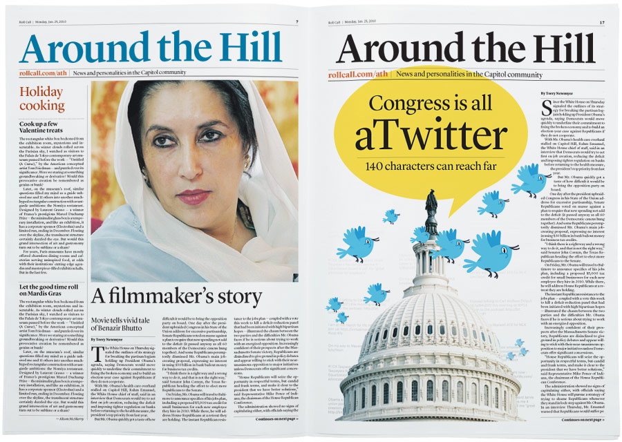
Roll Call was resistant to color on the nameplate and section flags. The nameplate ended up black, but the inside sections are now color.
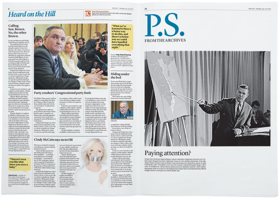
Typefaces used are Lyon Display, Lyon Text and Graphik — all available from my pal Christian Schwartz over at Commercial Type.