Oxfam America commissioned a huge study of the impact a $10.10 federal minimum wage would have on the country both at the state and congressional district levels. They asked me to create maps for a small slice of that data. But even that small slice was a big project —there are 20 maps users can explore and 486 print-ready scorecards. Also there’s twitter handles for everyone is congress so users can tweet details about their district and @mention their representatives and senators.
This wasn’t my first congressional map rodeo, but this version added more detail for urban areas like New York, markers for larger/notable cities across the country, and a search to look up a congressional district by street address or ZIP code.
Check the project out here.
A previous design change to CQ.com proved unpopular with customers. This design provided better page hierarchy and structure and shifted the page’s focus from time-consuming curated news wells to CQ Now, a partially automated feed of breaking news, updates and other key content. Click for a more complete view.
The annual 50 Richest Members of Congress project is big deal in CQ Roll Call land. This year 27 reporters, researchers, developers and fact-checkers worked on the project over the past 3 months. It’s generally a big hit and gets oodles of page views months and months after it goes up. This year we added lots more data, like breakdowns of asset types, with filtering, sorting and a graph view to help navigate through all the numbers.

Used Natural Earth’s raster files for the first time for the top map — their stuff is just gorgeous. And for you d3.js people: if the globe in the timeline look familiar, yes I repurposed Mike Bostock’s world tour. Page is here.

This interactive uses the newest version of my house districts map featuring faster load, render and zoom speeds.


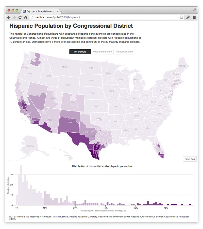
A d3.js map with constrained pan and zoom + bonus bars showing distribution + fun transitions limiting the view to Republican- or Democrat-controlled districts + hovers on the map give you the Rep’s name. A little overkill, perhaps, since there isn’t a strong editorial mission for this guy. The distribution bars were done for an immigration story in CQ Weekly to make the point that most Republicans in the House don’t have too much to fear from Hispanics in their home districts, and to name the few GOP outliers.
But 2014 election graphics are nigh, which means maps! So we attached this data to the beta version of our 113th House Congressional district map.
For this version, I trimmed the Census Bureau’s district shape file, which extends boundaries into lakes and oceans, to land boundaries using QGIS. Then I used TopoJSON to reduce the 110MB GeoJSON file down to around 300k, keeping only around 2.7% of the points. The result gives a acceptable detail scaled up to 5x. Sadly that isn’t enough resolution to make out Manhattan and some Los Angles districts, so I pushed the scale extent to 6 so that you can hover and find New York 10, even if simplification has made the island little more than a crooked rectangle. Another issue with the large scale factor is the state boundaries, which came from the National Atlas, don’t align perfectly to the district boundaries — the result of the simplification having different effects on the two GeoJSON files.
For the next version I’m going to try projected TopoJSON in hopes that it saves enough render time to put some more detail back in the map. Not sure what to do about the state boundaries other than edit the paths by hand in QGIS :-\

Immigration Bill: Will Past Be Prologue? My first project using d3.js takes a look at how the Senate votes for a immigration overhaul in 2006, and how the Senate today might be able to reach 60 votes to pass such a measure again.

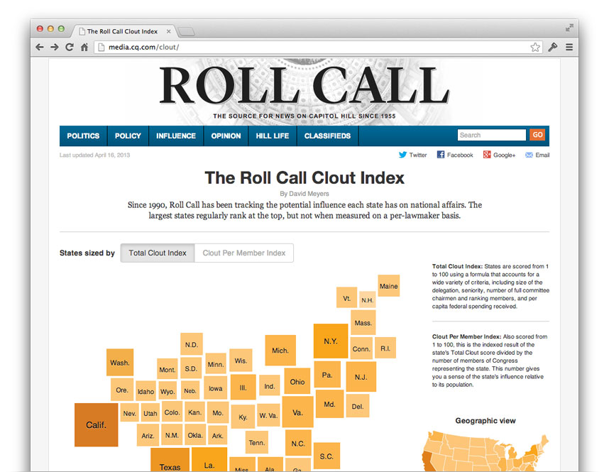
The Clout Index shows each state’s relative influence in Congress. The NYT’s electoral college graphic inspired the use of Demers cartograms, which worked out great because it’s easy to see in the transitions which states’ representatives have influence disproportionate to the number of people they represent.
The state boxes are simple divs so theIE people can at least see the cartogram, but alas, 50 animating divs results in choppy animation unless you’re using Chrome on computer with a good GPU.
See interactive on CQ Roll Call or my archived version with no external dependencies


