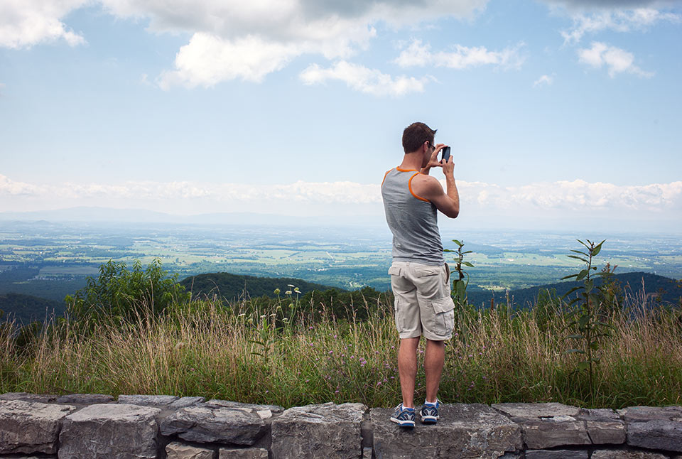
Since I can’t really afford to get a new Leica M, I’ve been wanting to test a Sony NEX camera with my Leica lenses to see if that would be a good alternative to my aging M8. So I borrowed Dan’s NEX-7 and bought a cheap Leica M to NEX mount adapter from Amazon and took it with me on a short trip to Charlottesville/Shenandoah area.
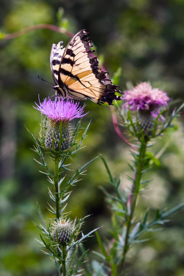
In short, it’s not for me. I got a couple of nice shots (like the butterfly above), but largely it was a flop.
The good:
- The camera is super light and easy to hold.
- The files are HUGE, so if you nail the focus you can do some extreme cropping and still get very usable files.
The bad:
- Focusing is tricky, and I found the focus peaking feature just about useless. You pretty much have to use the magnification mode to find the focus, which means you have to find and press a small button on the lower back of the camera every time you take a picture. None of my wide-angle landscape shots turned out to be in focus, which might have more to do with the adapter than the camera, but still it was almost impossible to see clearly enough in the viewfinder in bright light to ensure focus.
- The colors the NEX-7 produces are just weird. Usually Sony cameras produce overly saturated colors, but everything that comes out of the NEX-7 is just flat and dull. I spent a lot of time in Lightroom playing with color settings trying to get a nice rendition. Maurizio Paraccini’s camera profiles were a huge help.
- The magenta color cast on wider angle lenses is real and showed up on shots taken with my 28mm Summicron. Thought not nearly as bad as Steve Huff’s Voigtlander 15 shot.
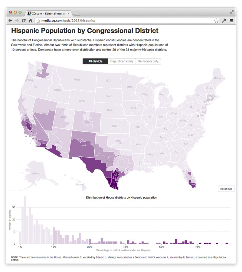
A d3.js map with constrained pan and zoom + bonus bars showing distribution + fun transitions limiting the view to Republican- or Democrat-controlled districts + hovers on the map give you the Rep’s name. A little overkill, perhaps, since there isn’t a strong editorial mission for this guy. The distribution bars were done for an immigration story in CQ Weekly to make the point that most Republicans in the House don’t have too much to fear from Hispanics in their home districts, and to name the few GOP outliers.
But 2014 election graphics are nigh, which means maps! So we attached this data to the beta version of our 113th House Congressional district map.
For this version, I trimmed the Census Bureau’s district shape file, which extends boundaries into lakes and oceans, to land boundaries using QGIS. Then I used TopoJSON to reduce the 110MB GeoJSON file down to around 300k, keeping only around 2.7% of the points. The result gives a acceptable detail scaled up to 5x. Sadly that isn’t enough resolution to make out Manhattan and some Los Angles districts, so I pushed the scale extent to 6 so that you can hover and find New York 10, even if simplification has made the island little more than a crooked rectangle. Another issue with the large scale factor is the state boundaries, which came from the National Atlas, don’t align perfectly to the district boundaries — the result of the simplification having different effects on the two GeoJSON files.
For the next version I’m going to try projected TopoJSON in hopes that it saves enough render time to put some more detail back in the map. Not sure what to do about the state boundaries other than edit the paths by hand in QGIS :-\
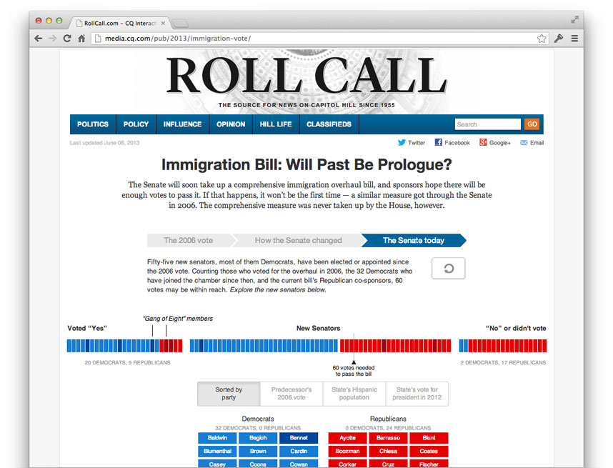
Immigration Bill: Will Past Be Prologue? My first project using d3.js takes a look at how the Senate votes for a immigration overhaul in 2006, and how the Senate today might be able to reach 60 votes to pass such a measure again.


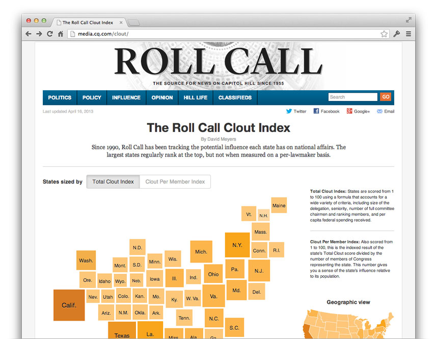
The Clout Index shows each state’s relative influence in Congress. The NYT’s electoral college graphic inspired the use of Demers cartograms, which worked out great because it’s easy to see in the transitions which states’ representatives have influence disproportionate to the number of people they represent.
The state boxes are simple divs so theIE people can at least see the cartogram, but alas, 50 animating divs results in choppy animation unless you’re using Chrome on computer with a good GPU.
See interactive on CQ Roll Call or my archived version with no external dependencies
More Maine/Mont Desert photos on my Flickr account


